The price depends on the number of pages, the complexity of the design, the features, the integrations, and the content management system. A custom website, an online store, and a standard WordPress site each involve a different scope of work.


Why Responsive Design Is a Must for Your Website in 2026

Kris
26 July, 2026
·
read in 17 minutes
Table of contents
An increasing share of website visits comes from smartphones, while users continue to browse through laptops, desktop computers and tablets. A website should maintain good readability, clear navigation and convenient interactions at every screen width. In 2026, responsive design forms part of the foundation of good user experience, technical SEO and effective online business presentation. A website which creates difficulties for mobile visitors loses attention, trust and potential customers.
What Is Responsive Design?
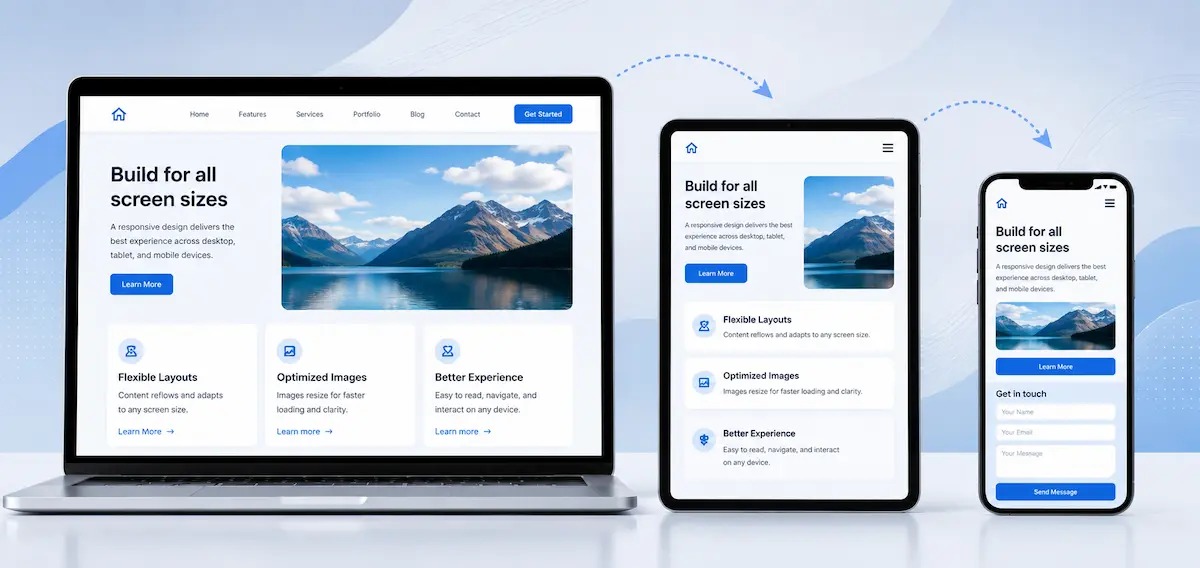
Responsive web design is an approach in which the page layout changes according to the available space and the characteristics of the device. Text remains readable, images are sized correctly, columns are rearranged, and buttons and forms remain convenient for touchscreen use.
The goal is not to shrink the desktop version to fit a smartphone screen. Every element should retain its purpose on smaller screens. Where necessary, content changes order, the menu takes a more compact form, and secondary elements give priority to the most important actions.
What Is the Difference Between a Mobile Version and a Responsive Website?
A separate mobile version usually represents an independent version of the website created specifically for smartphones. It often uses a different address, separate templates and its own maintenance logic. This approach increases the risk of differences in content, metadata and functionality.
A responsive website uses one main address and a shared structure. The design rearranges itself according to the screen without sending visitors to another version. This approach simplifies content management and reduces technical differences between mobile and desktop presentation.
Google recommends responsive web design as the easiest model to implement and maintain. This does not mean every responsive website automatically provides a good result. Layout, speed, content and interactions should be planned as one system.
How Is Responsive Design Built?
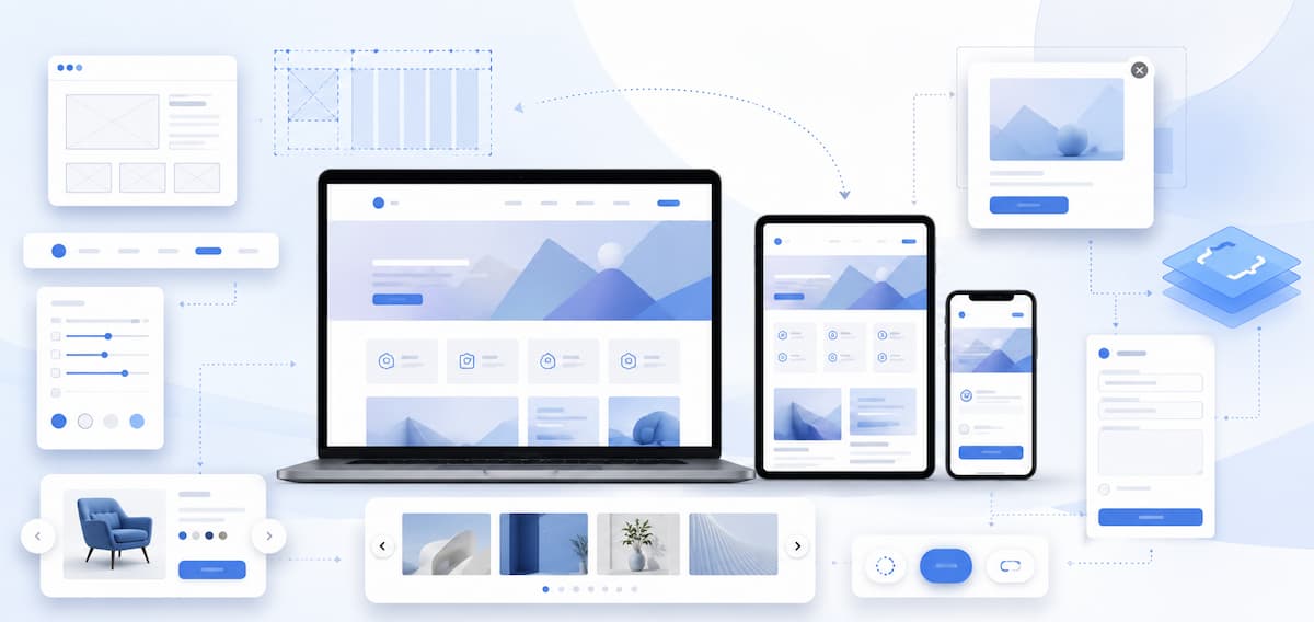
A good result starts during UX and UI planning. The designer defines how content, navigation and components change at different sizes. The developer turns this logic into a flexible structure which responds to the available space.
Common techniques include flexible columns, relative dimensions, media queries and images prepared in suitable versions for different screens. Modern CSS also offers container queries. With this approach, a component changes according to the size of its container rather than only according to the width of the entire browser window. This is useful for cards, product blocks, forms and sections placed in different areas of a website.
Responsive design also covers behaviour. The menu should open easily. Online store filters should be clear. Forms should display understandable fields and messages. Galleries, tables, pop-up windows and buttons should work with touch controls, keyboards and text enlargement.

Why Is Responsive Design Essential in 2026?
Mobile Traffic Represents a Large Share of Website Visits
In June 2026, mobile devices accounted for more than half of global web traffic, according to StatCounter. The share differs by country, industry and individual website, so your decisions should also rely on data from your own analytics platform.
These figures do not mean the desktop version is losing its importance. With B2B services, complex products and longer decision processes, users often begin their search on a smartphone and continue on a computer. The website should provide a consistent experience at every stage.
Google Evaluates Content Through the Mobile Version
Google uses mobile-first indexing, which means the mobile version takes priority when pages are crawled and evaluated. When important text, an internal link, an image or structured data is missing on mobile, the search engine receives less information than it receives from the desktop view.
A responsive website maintains one main set of content for all devices. This reduces the risk of differences between versions. Hidden sections, incorrectly loaded elements and features dependent on heavy scripts still create problems, even within a responsive layout.
Users Expect Fast and Clear Actions
Every obstacle feels more noticeable on a small screen. Text which is too small, narrow buttons, complex menus and long forms interrupt the path towards the desired action. Visitors rarely spend time trying to understand an inconvenient interface.
A good mobile page presents the most important information early. The heading explains the offer. The primary button is easy to find. Navigation does not cover the entire screen. The form requests only essential information. In an online store, selecting a variation, adding a product to the basket and completing payment follow a clear sequence.
Speed Is Part of the Responsive Experience
A page which looks good but loads slowly does not fulfil its purpose. Large images, heavy videos, unnecessary JavaScript and incorrectly loaded fonts place additional pressure on mobile devices and slower connections.
Core Web Vitals measure loading performance, responsiveness and visual stability. On a well-built responsive website, images have defined dimensions, content does not shift during loading, and selecting a menu or button produces a fast response. Design and performance should be planned together.
Accessibility Requires More Than the Correct Width
Responsive design should remain convenient when text is enlarged, screen orientation changes or the user works without a precise mouse. Small controls, weak contrast and overlapping content create barriers for many people.
WCAG 2.2 guidelines address the size and spacing of interactive elements, content reflow and text enlargement. These requirements also improve usability for people without permanent disabilities. Using a smartphone with one hand, browsing in bright light, fatigue or a temporary movement restriction also change the way a person interacts with a website.
What Business Benefits Does Responsive Design Provide?
A Shorter Path to Contact or Purchase
When users find information quickly and complete the desired action without obstacles, they are more likely to submit a form, finish an order or make a booking. The reason is not the screen size itself, but the removal of unnecessary steps and unclear elements.
For a service website, this means a visible telephone number, a short form and clearly presented services. For an online store, this means convenient filters, readable product information and a simple payment process. For a mobile application or software product, this means a clear explanation of features and a logical route towards a demo or registration.
A Better Foundation for SEO
Responsive design does not guarantee rankings in Google. It provides a more reliable technical foundation for crawling, indexing and good user experience. One address for each page simplifies the management of internal links, canonical URLs, metadata and content.
Results also depend on content quality, website structure, domain authority, technical condition and search intent. A responsive layout is one necessary part of SEO rather than a complete SEO solution on its own.
A Consistent Brand Presentation
Users should recognise the same business regardless of the device. Colours, typography, images and content tone should follow a consistent visual system. Responsive behaviour changes the layout, not the identity.
This is especially important for visits from social media, email campaigns and shared links. A large share of these visits begins on a smartphone. When the page opened after the click is difficult to use, the message in the advertisement or publication loses its effect.
Signs Your Website Has Responsive Design Problems
-
Horizontal scrolling appears on individual pages.
-
The text is too small and requires enlargement.
-
Buttons are positioned too close to one another.
-
The menu covers the content or is difficult to close.
-
Forms extend beyond the screen.
-
Tables, banners and images are cropped incorrectly.
-
Pop-up windows block the entire page.
-
The primary action appears too far down the page.
-
The mobile version contains less important information than the desktop version.
-
The page responds slowly when a menu, filter or button is selected.
Even one of these signs deserves attention. Problems often affect specific templates, product pages, forms or content added after the initial development rather than the entire website.
How to Plan Good Responsive Design
Arrange Content Around User Tasks
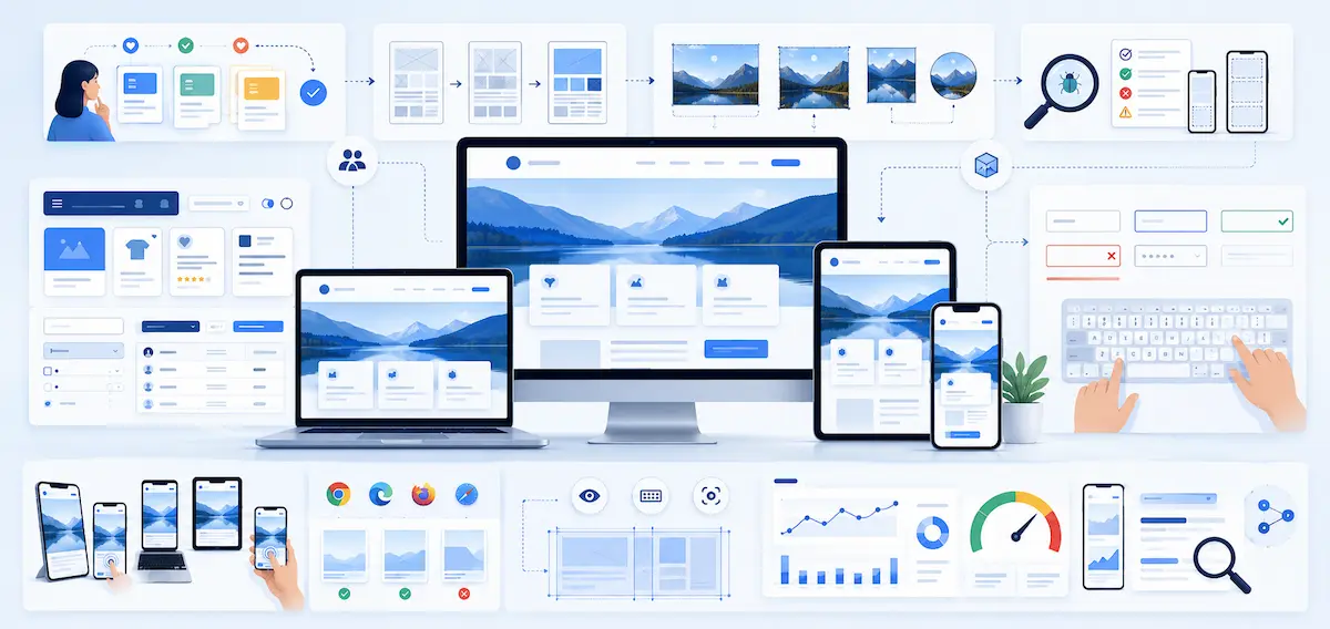
Identify what visitors are looking for and which action brings the greatest value to them. Avoid transferring every desktop element mechanically. Arrange the heading, main message, supporting evidence and primary action in a clear sequence.
Design Components Instead of Separate Page Images
Cards, forms, menus, tables and product blocks need clear rules for different sizes. This keeps the design stable when new content and future sections are added.
Prepare Images for Different Screens
One large image should not load on every device. Suitable file formats, different image sizes and defined proportions reduce loading requirements and keep the layout stable.
Test With Real Content
Short placeholder texts often hide layout problems. Long headings, different product names, error messages and translations affect the height and width of components. Testing should include difficult scenarios rather than only the ideal view.
Check Physical Devices and Browsers
A preview in a design file or simulator is not enough. Testing should cover smartphones with different screen sizes, tablets, desktop computers, touch controls, keyboards and enlarged text.
Review Data After Publication
Analytics data shows where visitors leave, which devices create problems and which forms remain incomplete. Search Console, PageSpeed Insights and user behaviour data provide different perspectives on the technical condition of the website.
Responsive Design Is Not a One-Time Task
New sections, plugins, banners, tables and integrations gradually change a website. An element which works well today might stop working correctly after an edit or the addition of new content. Responsive behaviour should therefore remain part of the design, development, content and QA process.
In 2026, a good website is not defined only by whether it opens on a smartphone. It needs to be readable, fast, accessible and easy to use in every context. Responsive design connects these requirements within one system and provides a stable foundation for future website development.
Do You Need a New Website or a Redesign?
At Studio Kipo, we design and develop websites through a UX and UI process, with close attention to responsive behaviour, speed, SEO and technical quality. We analyse the content, user tasks and business goals before defining the structure and interface.
Request a quote or contact us to discuss your website.
Share


FAQ:
How much does it cost to develop a responsive website?

Do you need to build a new website if your current one isn’t responsive?
Not in every case. Sometimes the existing structure allows for adjustments to the templates and styles. However, if the technology is outdated, the code is complex, or there are many accumulated issues, a redesign is often the more sensible solution.
Are off-the-shelf WordPress themes suitable for a responsive website?
Many modern themes include responsive templates, but this doesn’t guarantee a good end result. Added plugins, content, tables, forms, and customizations often cause problems on smaller screens.
How does responsive design affect advertising campaigns?
Ads often direct users straight to a specific page on a phone. If the page makes it difficult to view, fill out a form, or place an order, part of the advertising budget won’t deliver the expected value.
What should be done with videos, maps, and externally embedded elements?
They should be placed in flexible containers and maintain the correct proportions. It’s important to verify that controls remain accessible and that the element does not extend beyond the page width.
How long does it take to make an existing website responsive?
The timeframe depends on the technical condition of the website and the number of templates used. Making adjustments to a few pages requires less work than a complete redesign of the layout and code.
How are the dimensions determined at which the design changes?
These dimensions are determined based on the content and behavior of the components. It’s not right to focus solely on specific phone models. The change should occur when the layout begins to lose readability or functionality.
Does the website have to look the same on all devices?
No. The visual identity should remain consistent, but the layout adapts to the available space. On a phone, some elements are rearranged, shortened, or displayed differently.
How are tables with a lot of information adapted?
Tables require a separate solution depending on their content. Possible approaches include horizontal scrolling, converting rows into cards, or displaying only the most important columns on a small screen.
How often should a website’s responsiveness be tested?
Testing is necessary after changing a theme, template, plugin, form, menu, or important page. It’s also advisable to conduct periodic tests, as new content and updates often cause issues in certain viewports.
About the author
Kris is a WordPress Expert with over 5 years of experience who solves complex tasks - from custom themes and plugins to integrations with external systems. He is known for rapid debugging, resilient code, and best practices for maintainability and performance.
Related articles
SSL certificate - all advantages and disadvantages
An SSL certificate is now a standard for every website, not an optional extra. It provides a secure connection between the user’s browser and the server where the website is hosted. When a website uses HTTPS, data is transferred in a more secure way and the browser does not show a warning that the connection is not secure.
The topic, however, is not limited to “having a padlock in ...
Kris
May 28
·
17 minute reading
How can you tell if your website needs a redesign?
How to tell whether your website needs a redesign
A website is often the first place where a client meets your business. If the website looks outdated, loads slowly, or does not guide the user toward a clear action, the problem is not only visual. This affects trust, inquiries, sales, and SEO results.
A redesign does not mean only a new visual appearance. ...
Kris
May 21
·
16 minute reading
How to Choose a Domain Name and Web Hosting for a New Website
Choosing a domain and hosting is one of the first important steps in creating a new website. The domain is the name people will use to find you online. Hosting is the technical environment in which the website will operate.
If these two decisions are made hastily, problems will arise later. The website loads slowly, emails don’t work reliably, migration becomes ...
Kris
May 5
·
28 minute reading